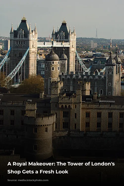
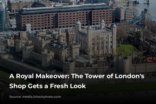
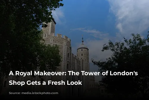
The Tower of London, England’s most popular paid heritage attraction, is a captivating piece of history, housing centuries of stories within its walls. Managed by Historic Royal Palaces, an independent charity, the Tower has always been a symbol of power and a vital piece of English heritage. Kinnersley Kent Design, a leading consultancy, has worked with Historic Royal Palaces on various projects, and recently completed a transformative redesign of The White Tower’s gift shop.

A Blend of History and Modernity
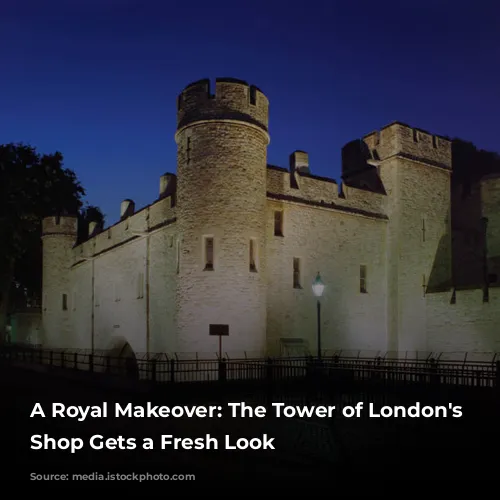
The White Tower, a 11th-century fortress palace, is the oldest building in the Tower of London complex and a remarkable example of Norman architecture. Visitors flock to this historic landmark, with an average of 7,000 visitors passing through each day, including a large number of international tourists. The White Tower houses a collection of weaponry and armor, and visitors exit through the 900 square foot gift shop, which sells a whopping 370,000 items annually.
The redesign of the gift shop presented a unique challenge. The goal was to create an engaging retail experience that seamlessly integrated with the historic building’s unique character. The designers had to balance the need for an exciting retail environment with the preservation of the building’s listed status, a Grade I Scheduled Ancient Monument.
A Respectful Transformation
Inspired by the grandeur of The White Tower, the new design embraced the building’s raw beauty, highlighting its high vaulted ceilings and stunning stonework. Rather than covering these features, the designers used natural materials, drawing inspiration from the building’s original construction and the weaponry on display above.
The existing layout had to remain unchanged due to the building’s protected status, but the designers cleverly optimized the flow of visitors. They replaced mid-floor units with grab-and-go displays, set back slightly into alcoves, creating a more spacious feel while still enticing visitors.
A Symphony of Materials and Light
All new display units and lighting were freestanding, adhering to the strict regulations regarding the building’s preservation. The bespoke modular displays are made of blackened steel, oak, burnt larch, and brushed brass, creating a stylish and robust aesthetic. Stainless steel mesh subtly references chain mail, adding a touch of historical flair while revealing the original stone walls behind.
Backlit display units cast a warm glow on the products, highlighting the texture of the historic walls. Three large, bespoke pendant lights hang over the central walkway, mirroring the vaulted ceiling and drawing the eye upward. Existing hoop lights were lowered to create a more intimate atmosphere in the alcoves, enhancing the display of products.
A Space for Discovery
The new design also incorporated architecturally-salvaged flagstones, seamlessly blending with the existing flooring to create a unified and spacious feel. While laying these new flagstones, a previously undiscovered Tudor wall was found, adding an unexpected layer of history to the project.
The redesign has positively impacted sales and enhanced the visitor experience, according to Historic Royal Palaces’ Head of Retail Operations. The new gift shop offers a more streamlined and engaging shopping experience, while respecting the historic building’s legacy.
A Perfect Harmony
The result is a dramatic, warm, and practical space that reflects the grandeur of The White Tower. The lighting, materials, and overall design create a premium feel that is both authentic and appropriate to its royal surroundings. The newly redesigned gift shop is a testament to the power of thoughtful design, creating an experience that is both enjoyable and respectful of its historical context.
